GRAPHIC DESIGNER

Eye of Newt Projects
Eye of Newt is a natural soap and cosmetic manufacturing company that I developed two years ago. I designed four logos for the business including a wordmark, a symbol, a lock-up featuring both together, and an additional emblem with more illustrative qualities. The reason I chose the name Eye of Newt is to show the classic elegance of this historical phrase that has long had to do with witches and spellcraft, originally used in the famous play, Macbeth written by Shakespeare. It is a classic phrase that demands attention, but also receives intrigue.
Logos / Emblems

Wordmark

Logo Lock-up
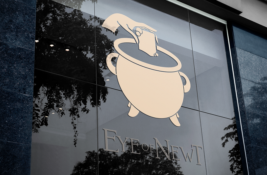
I chose a cauldron for the symbol for similar reasons, as a cauldron is a classical symbol of witches and speaks to the theme very well. The cauldron is also easy to discern due to it's simple appearance. I took the simple and clean approach with the emblem design and pushed it a bit further to show the femininity of the hand dipping a bar of soap into the cauldron to complete the four brand marks.

Symbol

Emblem
Packaging and Brand Elements
Here, I chose a combination of the illustrated emblem with the wordmark. I love how much detail and intrigue the delicate hand gives the viewer when used as a window decal.